Analysing reaction times - Revisiting Ratcliff (1993) (pt 1)
Reaction times are a very common outcome measure in psychological science. Frequently, people use the mean to summarise reaction time distributions and compares means across conditions using ANOVAs. For example, in a typical experiment, researchers might record reaction times to familiar and unfamiliar faces, and look for differences in mean reaction time across these two types of stimuli.
An issue with this is that reaction time distributions are skewed: there are many more short values than long values, so their distribution has a long right tail. The mean of such distributions is drawn out towards the tail. Unlike in normally distributed data, it becomes quite different from the median, which is the midpoint of the distribution. Thus the mean is influenced by the skewness of the distribution in a way that the median is not. In addition, the median is robust to outliers.
A classic article from 1993 by Ratcliff 1 examined how outliers in reaction time distributions impacted statistical power, and how a variety of different methods can be used to mitigate their influence. I’m going to replicate some of his simulations here.
RTs can be modelled as coming from an ex-Gaussian distribution. An ex-Gaussian 2 is the sum of a Gaussian and an exponential distribution, and has three parameters - the mean of the Gaussian (mu), standard deviation of the Gaussian (sigma), and the mean of the exponential (tau). Between them, sigma and tau effectively control the rise of the left tail of the distribution and the fall of the right tail. Let’s simulate an ex-Gaussian by generating a normal distribution with a mean of 400 and SD of 40, an exponential distribution with a mean of 200 (this is given by a rate parameter in R’s rexp() command - divide 1 by your desired mean.) and adding them together.
exGauss <- data.frame(RT = rnorm(1000, 400, 40) + rexp(1000, 1 / 200))
p <- ggplot(exGauss, aes(x = RT)) +
  geom_histogram() +
  theme_classic()
p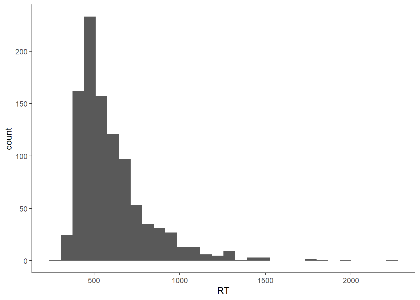
As always, other things come into play during psychology experiments. People get bored or press buttons too quickly. Our distributions become contaminated with outliers. Ratcliff simulated this by replacing values from the sample distribution with values from a second distribution. Note that this is outliers in the sense of datapoints drawn from a distribution other than that related to the process of interest. In fact, such outliers can easily by embedded unnoticed within the distribution generated by the genuine process, and are as such impossible to detect. Thus, in general, it’s only the really short or really long outliers that can be identified as being outliers.
R has functions built-in to generate data from a lot of distributions, but not ex-Gaussians. So first of all I create a helper function to produce ex-Gaussian distributions with specified parameters - mu, sd, and tau. Here’s a bunch of distributions produced by combining two distributions: a reference ex-Gaussian distribution which exemplifies the process of interest, and an outlier ex-Gaussian distribution with a mean 1 or 2 standard deviations away from the mean of the reference distribution, as in Ratcliff (1993).
# define a helper function to generate an ex-gaussian

exGausDist <- function(nObs = 1000, mu = 400, sd = 40, tau = 200) {
  round(rnorm(nObs, mu, sd) + rexp(nObs, 1 / tau))
}

# Generate the various distributions + outliers
exampleDists <- data.frame("Reference" = exGausDist(),
                           "Minus 1 Sd" = c(exGausDist(nObs = 800), exGausDist(nObs = 200, mu = 200)),
                           "Plus 1 Sd" = c(exGausDist(nObs = 800), exGausDist(nObs = 200, mu = 600)),
                           "Plus 2 Sd" = c(exGausDist(nObs = 800), exGausDist(nObs = 200, mu = 800)))

gg2 <- exampleDists %>%
  gather(distribution,RT) %>%
  ggplot(aes(x = RT)) +
  geom_histogram(binwidth = 50) +
  facet_wrap(~distribution) +
  theme_bw()

gg2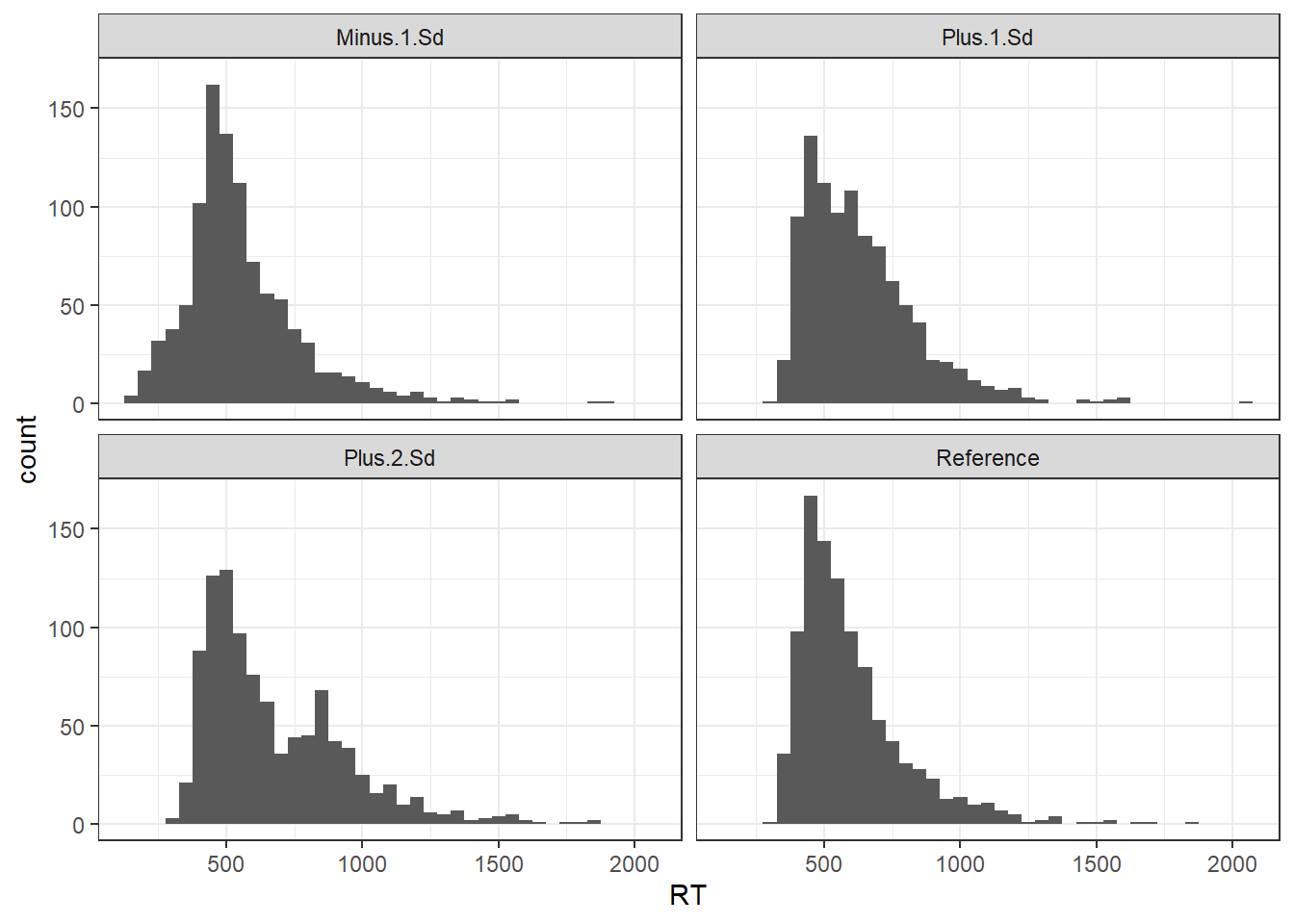
Note how with the “Plus 1 SD” distribution, the outliers are pretty much impossible to tell apart from the genuine process - there’s a more noticeable but still not exceedingly obvious bump in the tail of the “Plus 2 SD” plot, and an early bump in the “Minus 1 SD” plot.
Ratcliff-style experimental simulations
Ratcliff (1993) ran simulations testing how various methods of dealing with outliers stood up. To generate RT distributions, Ratcliff created distributions in which 90% of the values were drawn directly from a genuine ex-Gaussian distribution, and 10% drawn from the same distribution but with a random number between 0 and 2000, drawn from a uniform distribution, added to it. Ratcliff also introduced inter-subject variability by vary individual subject means by a random number between -50 and 50, again drawn from a uniform distribution.
Let’s start by building a helper function to generate data distributions with a specified proportion of outliers. I then create a second function to generate a full set of experimental data as per Ratcliff. This generates data for a 2 X 2 design with within-subjects factors A and B. Ratcliff generated data for 32 subjects, with 7 trials in each condition (more on that later), an ex-Gaussian distribution with parameters mu = 400, sigma = 40, and tau = 200, and a main effect in factor A, so let’s make sure we can vary all those things at will.
exGausDist <- function(nObs = 1000, mu = 400, sd = 40, tau = 200, outProb = .1) {
  #generate vector of trials
  tmp <- round(rnorm(nObs, mu, sd) + rexp(nObs, 1 / tau))
  #pick the lucky ones
  rollD <- as.logical(rbinom(nObs, 1, prob = outProb))
  outliers <- round(runif(sum(rollD), 0, 2000))
  #add the outliers to the genuine distribution
  tmp[rollD] <- tmp[rollD] + outliers
  tmp
}

## Custom function to generate a Ratcliff style dataset.
## Main effect is always in A.
## Defaults reflect first set of simmulations in Ratcliff (1993)
ratcliff <- function(nSubs = 32, mainEffect = 0, mu = 400, subjVar = 50,
                     nObs = 7, outProb = 0, tau = 200, sigma = 40) {

  #generate a vector of individual subject means with variance drawn from
  #a uniform distribution
  subMeans <- rep(mu, nSubs) + runif(nSubs, min = -subjVar, max = subjVar)

  #generate a full dataset
  ratcliff_data <- data.frame(
    A1.B1 = unlist(lapply(subMeans,
                          function (x) do.call(exGausDist,
                                               list(nObs = nObs, mu = x,
                                                    sd = sigma, tau = tau,
                                                    outProb = outProb)))),
    A1.B2 = unlist(lapply(subMeans,
                          function (x) do.call(exGausDist,
                                               list(nObs = nObs, mu = x,
                                                    sd = sigma, tau = tau,
                                                    outProb = outProb)))),
    A2.B1 = unlist(lapply(subMeans,
                          function (x) do.call(exGausDist,
                                               list(nObs = nObs,
                                                    mu = x + mainEffect,
                                                    sd = sigma, tau = tau,
                                                    outProb = outProb)))),
    A2.B2 = unlist(lapply(subMeans,
                          function (x) do.call(exGausDist,
                                               list(nObs = nObs,
                                                    mu = x + mainEffect,
                                                    sd = sigma, tau = tau,
                                                    outProb = outProb)))),
    Subject = factor(rep(1:nSubs, each = nObs)))

  ratcliff_data <- ratcliff_data %>%
    gather(condition, RT, -Subject) %>%
    separate(condition, c("A", "B"))
  ratcliff_data
}

ratcliff_data <- ratcliff()

ggplot(ratcliff_data, aes(x = RT)) +
  geom_density(aes(fill = Subject), alpha = 0.5) +
  facet_grid(B ~ A) +
  theme_bw()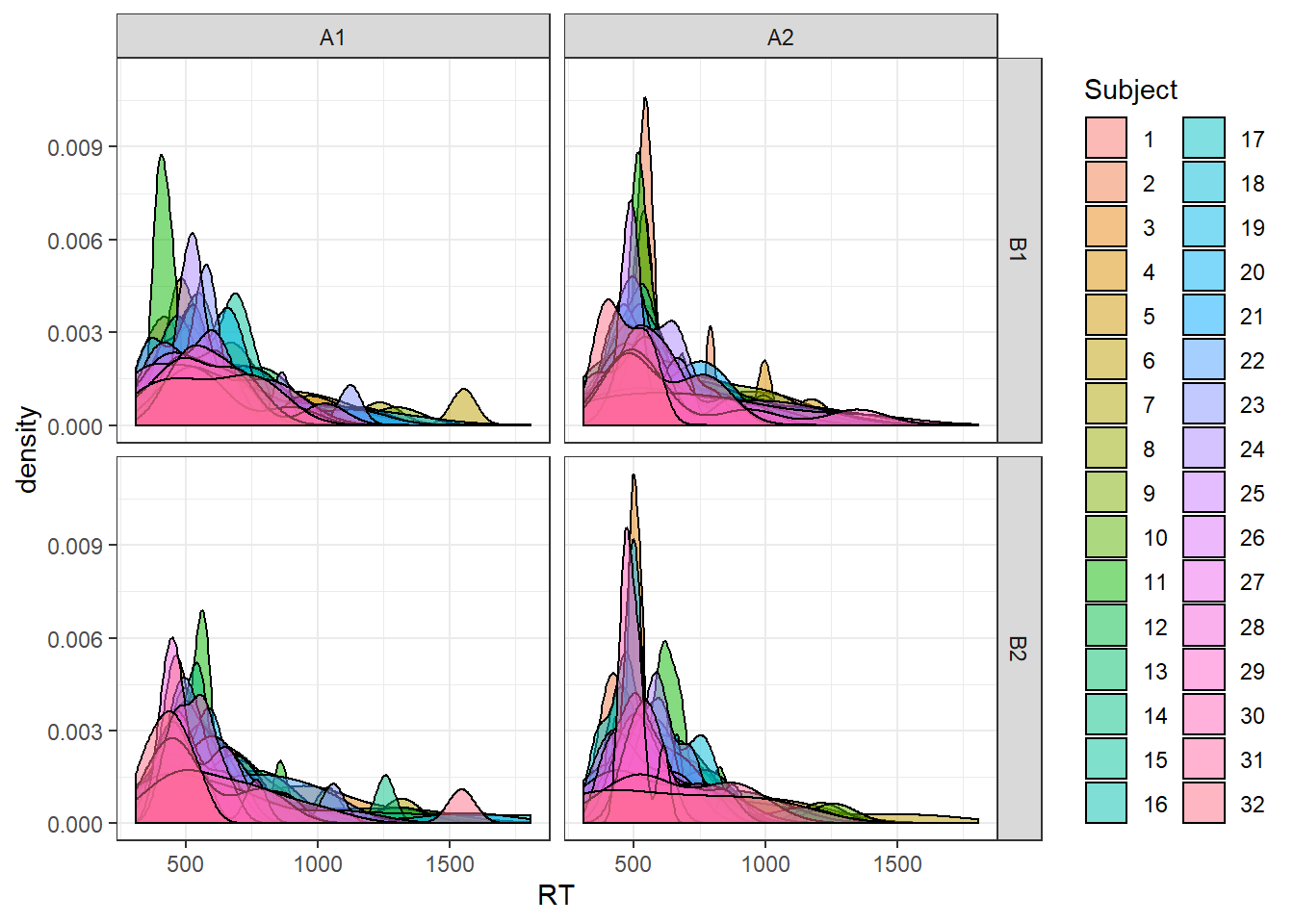
The above plot shows kernel density estimates of the generated distribution for each subject, for each condition.
So now we have a function that can simulate Ratcliff’s simulated datasets. Ratcliff generated 1000 simulated datasets and ran a 2X2X32(!) ANOVA for each one using a variety of methods for dealing with outliers. I’ll go with the normal 2x2 repeated measures ANOVA.
Let’s write yet another function: this one generates a dataset using the ratcliff() function I wrote above, then summarises it using all the cutoffs, transformations and statistics used by Ratcliff. Ratcliff uses:
- mean RT with
- no cutoff
- cutoff at 1000ms, 1250ms, 1500ms, 2000ms, or 2500ms
- cutoff at 1 or 1.5 standard devations (SD) above the mean (calculated across all conditions, not separately)
- mean RT after the maximum RT in each condition is removed;
- Winsorized mean - values more than 2 SD above the mean replaced with 2 * SD
- median RT
- mean log-transformed RT
- mean inverse-transformed RT (1/RT)
runSims <- function(mainEffect = 0, outProb = 0, nObs = 7) {

  #Generate the initial dataset - default
  tmp <- ratcliff(mainEffect = mainEffect, outProb = outProb, nObs = nObs)

  summary_data <- tmp %>%
    group_by(Subject) %>%
    mutate(scaled_RT = scale(RT),
           windsor = ifelse(scaled_RT >= 2, sd(RT) * 2, RT)) %>%
    group_by(Subject, A, B) %>%
    summarise(meanRT = mean(RT),
              medianRT = median(RT),
              invTr = mean(1 / RT),
              logTr = mean(log(RT)),
              trim_Max = (sum(RT) - max(RT)) / (n() - 1),
              mean_1sd = mean(RT[scaled_RT <= 1]),
              mean_1.5sd = mean(RT[scaled_RT <= 1.5]),
              windsor = mean(windsor),
              cut_2500 = mean(RT[RT < 2500]),
              cut_2000 = mean(RT[RT < 2000]),
              cut_1500 = mean(RT[RT < 1500]),
              cut_1250 = mean(RT[RT < 1250]),
              cut_1000 = mean(RT[RT < 1000])
              )

  #Reshape to tidy format, split the DF based on the measurement type,
  #and run ANOVA for each type of measure.
  aov_results <- summary_data %>%
    gather(measure, RT, -Subject, -A, -B) %>%
    split(.$measure) %>%
    map(~aov_ez("Subject", "RT", data = ., within = c("A", "B")))

  pA <- map_dbl(aov_results %>% modify_depth(1, "anova_table") %>% map("Pr(>F)"), 1)
  pB <- map_dbl(aov_results %>% modify_depth(1, "anova_table") %>% map("Pr(>F)"), 2)
  pAxB <- map_dbl(aov_results %>% modify_depth(1, "anova_table") %>% map("Pr(>F)"), 3)
  return(list("pA" = pA,"pB" = pB,"pAxB" = pAxB))
}
The function returns a list of the p-values for each ANOVA term for each different type of measure. It’s not enough to run that just once of course - we need to run it over and over again. We’ll replicate Ratcliff’s first set of simulations. He simulated data from 32 subjects, from a 2 X 2 factorial design, with 7 trials per condition. The ex-Gaussian was generated with the normal part having a mean of 400 ms and standard deviation of 40 ms, and the exponential part having a tau of 200 ms. Ratcliff added a main effect of 30 ms, so that both the interaction and other main effect were null, and ran the simulations 1000 times. To show the effect of outliers, he also ran the simulations twice: once with 10% outliers, and once with no outliers.
nSims <- 1000

no_outliers <- replicate(nSims, runSims(mainEffect = 30))

Apow_no <- do.call(rbind, no_outliers[1, ])
#Uncomment these lines if you want to check the main effect of B and AxB interaction
Bpow_no <- do.call(rbind, no_outliers[2,])
AxBpow_no <- do.call(rbind, no_outliers[3,])

ten_perc <- replicate(nSims, runSims(mainEffect = 30, outProb = 0.1))

Apow_ten <- do.call(rbind, ten_perc[1, ])
Bpow_ten <- do.call(rbind, ten_perc[2, ])
AxBpow_ten <- do.call(rbind, ten_perc[3, ])

# combine output into single frame and convert to 1s and 0s (sig versus not sig)
all_ps <- data.frame(rbind(Apow_no, Apow_ten))
all_ps <- data.frame((all_ps <= .05) + 0)
all_ps$outliers <- rep(c("None", "10%"), each = nSims)
both_outliers <- all_ps %>%
gather(measure, percent, -outliers) %>%
mutate(measure = fct_relevel(measure, "meanRT", "cut_2500", "cut_2000",
"cut_1500", "cut_1250", "cut_1000", "logTr",
"invTr", "trim_Max", "medianRT", "mean_1.5sd",
"mean_1sd", "windsor")) %>%
ggplot(aes(x = measure, y = percent, colour = outliers)) +
stat_summary(fun.y = "mean", geom= "point", size = 4) +
ggtitle("30ms main effect in mu") +
labs(y = "Proportion of significant tests p < .05 ") +
ylim(0, 1) +
scale_color_brewer(palette = "Set1") +
scale_x_discrete(labels = c("mean", "2.5s", "2s", "1.5s", "1.25s", "1s",
"log(RT)", "1/RT", "trim", "median", "1.5 SD",
"1 SD", "Wind")) +
theme_minimal()
ggplotly(both_outliers)The stimulation results match up nicely with Ratcliff’s. We can see clearly that all methods have worse power in the presence of 10% outliers. The effect of outliers decreases as the cutoffs become more extreme, with very restrictive cutoffs of anything over 1s having very similar power. The inverse transform (1/RT) has the highest power overall, even performing well with outliers. Both the mean, the 2.5s cutoff mean, and the trimmed mean (maximum RT deleted) suffer the most from outliers, with drops in power of some 30-40%.
Any effect on Type 1 error for the other, null main effect?
null_ps <- data.frame(rbind(Bpow_no, Bpow_ten))
null_ps <- data.frame((null_ps <= .05) + 0)
null_ps$outliers <- rep(c("None", "10%"), each = nSims)

null_plot <- null_ps %>%
  gather(measure, percent, -outliers) %>%
  mutate(measure = fct_relevel(measure, "meanRT", "cut_2500", "cut_2000",
                               "cut_1500", "cut_1250", "cut_1000", "logTr",
                               "invTr", "trim_Max", "medianRT", "mean_1.5sd",
                               "mean_1sd", "windsor")) %>%
  ggplot(aes(x = measure, y = percent, colour = outliers)) +
  stat_summary(fun.y = "mean", geom= "point", size = 4) +
  ggtitle("Null main effect") +
  labs(y = "Proportion of significant tests p < .05") +
  scale_color_brewer(palette = "Set1") +
  scale_x_discrete(labels = c("mean", "2.5s", "2s", "1.5s", "1.25s", "1s",
                              "log(RT)", "1/RT", "trim", "median", "1.5 SD",
                              "1 SD", "Wind")) +
  ylim(0, 1) +
  geom_hline(yintercept = 0.05, linetype = "dashed") +
  annotate("rect", xmin = 0, xmax = 14, ymin = 0.025, ymax = 0.075, alpha = 0.4) +
  theme_minimal()

ggplotly(null_plot)
For all measures, the results are close to the nominal alpha of .05 - I’ve marked the region from .025 to .075 with a grey rectangle. The interaction term comes out much the same. So in other words, most of the procedures increase power without increasing the rate of false positives.
A couple of things I always wondered about with these simulations: Normally data that comes from within subjects is correlated, and there’s no attempt to manipulate that here, and the number of trials per condition is very low at 7, which seems like it may exacerbate the influence of outliers in general. The size of the main effect should probably follow a normal distribution rather than being a flat 30ms for everyone. And the between-subject variability in general might be better represented by a normal distribution too. I wouldn’t expect all of these to influence the main conclusions, but I’ll have a look at that at a later date.
Matt Craddock
I'm a research software engineer